In addition to some feedback I got about the "pinched border" design, my son told me it looked more like an insert than a set card. And with the red, white and blue border, it should be my opening day lineup insert set. Fair enough.
So I'm dusting off an older design from maybe two seasons ago when I first started making customs and offering it up for critique and/or possibly making it the 2013 team set template. I'm not sure of the original inspiration (there is one, but I can't put my finger on it). Maybe a minor league set I saw somewhere? I usually take something I like as a starting point and tweak it to meet my needs, although I try to keep from copying outright. Hopefully my new tweaks didn't reverse my original tweaks and make this flat out plagiarism!
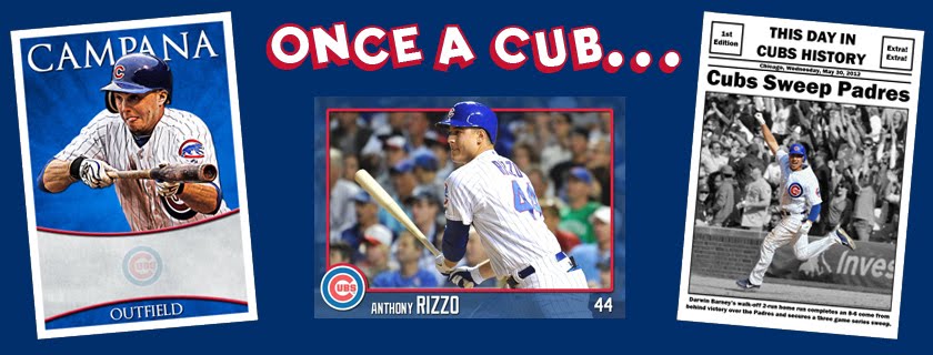
I went back to a horizontal layout but with this particular design, the photo I use is almost square. This allows me to use just about any photo, which I really like. Like last year's set, the font for the name and jersey number is the same as the one they actually use on the backs of the jersey.

I took that a step further and made the number really look like on the back of the jersey, a red number with white border. Yes, I know that's the color combo on the away jersey, but with the blue backround on the card, that's what looked better.

Here are a couple of other players to see how it works with different photos. Sometimes I build a template around one particular photo only to realize it doesn't translate well. Like the "pinched border" one last week. These particular photos are older (you can make out the Santo patch on Garza's sleeve) so they won't be the final photos used. They're also a bit darker than I'd like, especially if I hope to get them autographed.


And then I took it one step even further and made the name match the number. That seemed like a bit too much red so I adjusted the team name bar to the Cubs fourth color, grey.

I'd love to hear anybody's opinion, good and bad, about anything on the card (except the team, haha). Or even if you prefer the other card to this one.
Another thing to think about. I'd like to fit the position in there as well but can't find a good place. It was too crowded down in the corner by the number. And it can't go above the team name bar because of longer names. Think Samardzija and Schierholtz and Villanueva. When it comes down to it, I prefer number over position because the Cubs have so many utility players.
Thanks!
No comments:
Post a Comment