
I have nine variations of Campana's 2011 Topps Update card. Yes, 9. All except the 1/1 Canary Yellow and 3 printing plates. To see them individually (and the rest of my TC PC), click the tab up at the top or here.
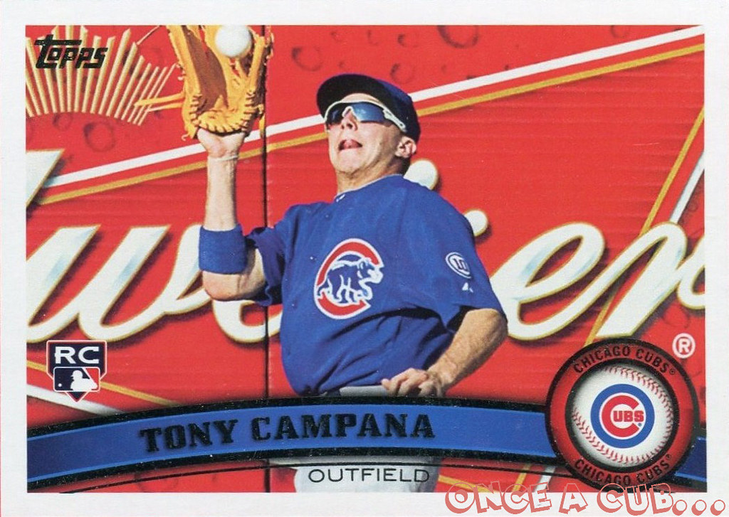
They look nice in a binder page since there are 9 but I'm looking to do a little bit more. For a refresher, here's the base card:
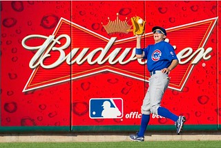
I also have a copy of the original photo Topps used to make the photo:
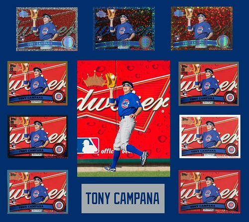
I would like to get a 8x10 copy of the photo autographed, and then have it matted and framed with the nine variations. But I am having a hard time deciding how to crop the photo. I've done two quick photoshop mockups of what I'm talking about and would be interested in hearing everyone's opinions about which way to go.
The background matting is Cubs blue but I will probably go with a double or triple mat with the other Cubs colors. The spacing isn't perfect and obviously the "name plate" will be a lot nicer. Like I said, this is just a quick mockup.
Option 1:
Cropped so that the photo is vertical rather than horizontal and you can see all of Tony Campana. Would probably get it signed in the upper right hand corner of the photo.
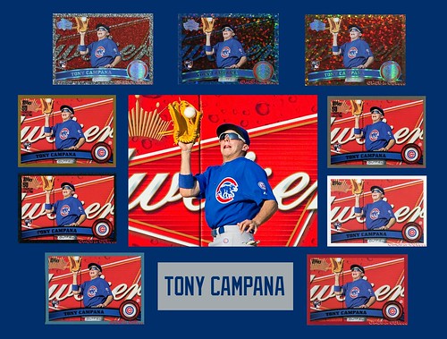
Option 2:
Photo loses quality with this tight of a cropping but it is cropped more like the card. Autograph still probably in upper right hand corner.
Definitely interested in hearing opinions and/or other ideas! Thanks!