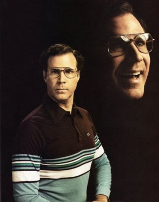
Even cards I've made large runs of (ATCRCS, 2012 team set) can sometimes be hard to work with on certain photos. But I consider those amateur problems! Not something the professional card companies with much more means than I have should worry about...right?
On a related note (don't worry it'll tie in), it's my birthday month so I went out and bought myself something pretty. I've been lurking on eBay a little lately, mostly trying to find the remaining Tony Campana printing plates. But every once in a while, I'll expand my searches looking for a deal. I picked up a lot featuring a couple thousand Cubs cards trying to make a dent into my non-Topps Cubs collection. I'll go into more details in later post(s) this week but for now, I just wanted to feature a couple of cards that caught my attention in the span of one short stack. And not necessarily in a good way. Which brings me back to photo selection...
.jpg) |
| 1989 Fleer Andre Dawson |
I'm not sure if the intent was for Andre Dawson to come off looking like a badass here or what. But to me, he just looks disgusted with something. Reminds me of the McKayla Maroney meme from the summer. Maybe the Hawk is not impressed.
On the other hand, Kevin Roberson here likes what he sees. This may not be the last you see of these two cards. I'm thinking Once a Cub memes...
 |
| 1994 Upper Deck Kevin Roberson |
.jpg) |
| 1987 Topps Ed Lynch |
This card of Dan Plesac is something that I think was a good idea but poorly executed. Or maybe just a poor idea? At first glance I was wondering why the bad crop job and why there was so much black space at the top. But a closer look showed me that there is another ghostly Plesac over his left shoulder, probably at the beginning of his pitching motion. I don't know the technical photography terminology but it looks like something to do with the exposure?
.jpg) |
| 1994 Topps Stadium Club Dan Pesac |
Last, but not least, is this gem of Jeff Pico. I remember Upper Deck being heralded as a groundbreaking set in terms of photography. But after going through this stack of cards, 20+ years later, I'm not sure it holds up. Why oh why would you crop this photo in such a manner? Why cut off his head/hat? Why are we getting a Mark Grace cameo when Pico (you know, the subject of the card) could be front and center, not off to the side?
 |
| 1989 Upper Deck Jeff Pico |


No comments:
Post a Comment