But I knew I had duplicates copied over as I tend to just drag a whole folder onto the hard drive so I've started to go through folder by folder, rename a few things and delete others. I once mentioned that part of my agreement with my wife about getting back into collecting was that I would be more organized. Well that means digitally too.
Among the various photo files, I came across a whole slew of custom cards. Some good first attempts but some cringeworthy ones too. I was using player photos that were too small. The resolution wasn't good enough. My Photoshop skills (if I can call them that) themselves were brand spanking new.
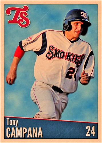
I can't pinpoint exactly when I became a fan of Tony Campana but apparently, it was at least several years ago when he was with the Double-A Tennessee Smokies. Here is one of my early designs, probably 2nd or 3rd. Pretty sure I followed some step-by-step instructions to make this while tweaking some things along the way but the source is long forgotten.
Knowing what I know now, I can say that this card, as is, will print out much too dark. I'd probably make a few other changes too but overall, I still kind of like the vintage-y look to it. An updated version of this might make my 2013 team set shortlist.


Looks good! I'm not sure what changes you'd wanna make, but it does have a nice "vintage-y" look to it.
ReplyDelete