
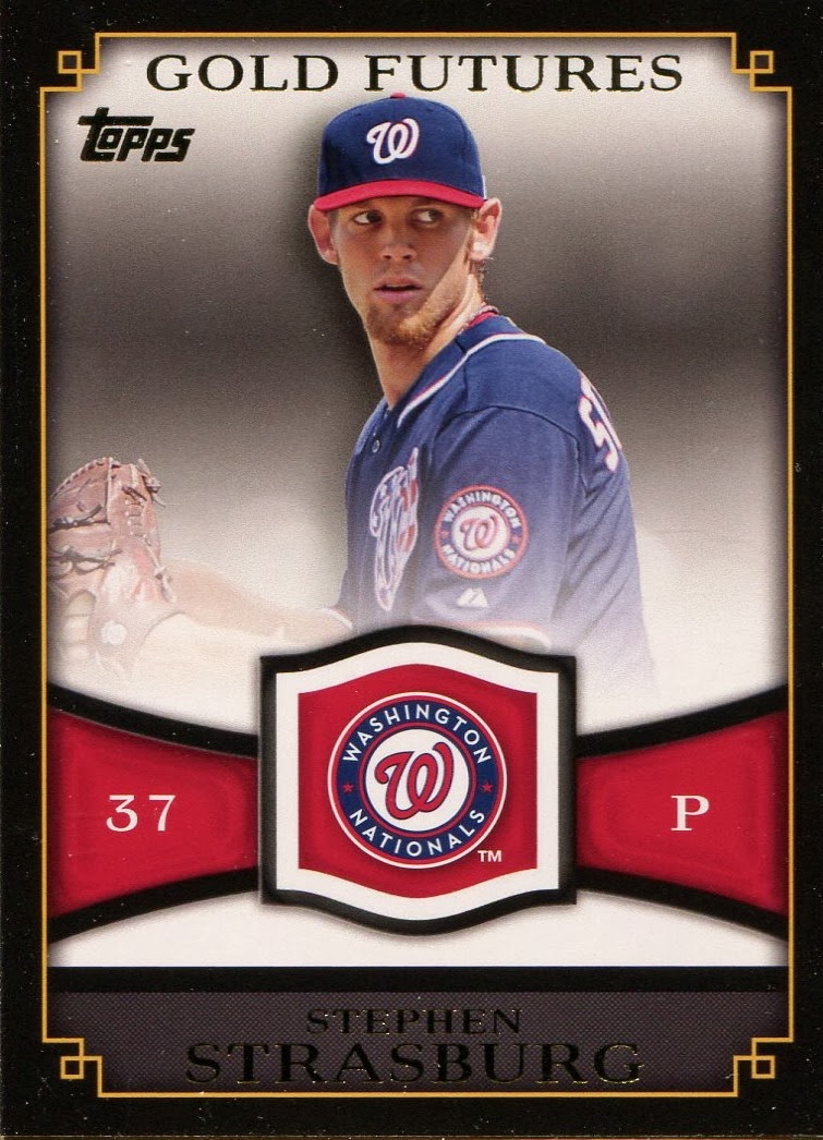
I've been fiddlin' around on Photoshop again trying to find a little inspiration. While I generally try to stay away from blatantly copying other designs, I really liked the Gold Futures inserts from 2012 Topps so I used it as my starting point. The Strasburg below is the base insert but they also came as jersey cards where a swatch would replace the team logo.
As most of you know, I collect Cubs cards and will try to get them signed when I can. So I tweaked the design a bit to make an autograph-able version. But sometimes I give myself too many options and can't make a decision, which is where I hope you come in.
Below are twelve different versions of the same basic card. Three border choices, with four different backgrounds within each. I've added a facsimile signature to show how a blue sharpie might clash or coordinate with each combo. At the end, there is a tiled grid that will give them to you all together instead of having to scroll back and forth.
First up we have the black border, most similar to the original. But the swatch area has been replaced with a signature area and the position and jersey number have moved down to join the name. The left card has a black and white background behind Starlin Castro. The right side maintains the original color background.


Below, the left side tints the background blue, while the right side tints it red (both Cub colors).


Next up, I tried to differentiate it a little more from the Gold Futures cards by changing the outside border to Cub blue and you'll see a little marbling to give it some texture. The backgrounds are the same as above, black & white, original color, blue tinting and red tinting.


Thinking it might be a little too blue, I also tried a Cub red outside border with the same four backgrounds. I tried changing the gold border to red with the blue borders and blue with the red borders, but I still liked the gold better.


And the tile. If I did this right, you can click on it and it will blow it up to your full screen.

The easiest to do would be the original color background (first column of the grid). The other three backgrounds all require the same amount of effort, more but not horrible. I don't want to taint anybody's opinion so I'll wait to get a little feedback before I let you in on which one(s) I favor.
Because it is so similar to an existing design, this more than likely won't be my 2014 Cubs team set, but I'll probably still use it for random stuff. Thanks for looking!
The blue and red borders. Ehhh....I don't know. Just kinda not working for me. I think the B&W background looks the best.
ReplyDeleteI'll agree w/Jeff, I think the black borders are the best, but I don't mind the blue borders or the blue tint. Not a huge fan of the red, but that might just be because it wouldn't look good with the Padres color scheme. Very cool to see the thought process that went into the designs, thanks for sharing!
ReplyDeleteThanks for the feedback guys. I agree on the blue and red. I like the black but as I mentioned, I was trying to get further from looking too much like the original. The red looks kind of McDonald-sy to me...or even worse, Cardinal-sy! But I thought I would try it since my last two Cubs team sets have been blue bordered.
ReplyDeleteMy favorite is probably the black border with the red tint. The color background looks a little too busy. The black and white looks to plain. And the blue background looks a little too blue. I think the red background contrast nicely with the blue in the uniform and what the signature would look like. The black border with the black & white background would probably be the best to go with any team though.
Thanks again!
In the shot complete of the dozen shown above, I like the top left. Black border with natural background. I almost feel that Starlin is fading into the backgrounds on the B&W and blue tinted cards. Perhaps if he had a different jersey than the gray top it would be better? Red? No way. Once a Cub is right, too Cadinal-sy!
ReplyDelete