With the 2014 Factory team sets I've been picking up, Topps has included a $0.50 coupon for just about any other 2014 Topps product with the cards. Figuring I could spend $9.49 with a coupon on a hanger box of 72 cards or $8.98 with two coupons on two rack packs for the same 72 cards, I went with the smaller packs.
I know there's some hate for the base design and I'm probably in the minority still for liking it, but there were some cool cards in the pack. Let's start with the inserts.
The first pack was a Sonny Gray hot pack. Look at all that green.
The other two inserts from the first pack are Photoshop Specials. Brian Bogusevic played for the Cubs last season so I look forward to breaking the base card down on my other blog, when I get back around to it.
Apparently, I didn't get enough Oakland in the first pack, so Topps threw a Jarrod Parker at me too.
The Stephen Strasburg is probably the only keeper in the bunch for me, and really that's for my son, who for some reason still thinks he's a Nats fan.
I pulled a sextet of Rookies (one more shows up later), and surprisingly, I've heard of all of them. Mike Belfiore and Taylor Jordan are local market guys. Christian Bethancourt came through the Carolina League with the Lynchburg Hillcats against my local Potomac Nationals and I think my kids got a Pro Debut card or two of his signed. Rob Wooten manages to shut down my Cubs every time he faces them. And Roger Kieschnick reminds me of his uncle, former Cub Brooks Kieschnick (for better or worse).
How about a Topps All-Star rookie and a Future Stars card?
I did pull one more Futures Stars card. Or is Adam Eaton a Power Player? Make up your mind, Topps!
Bear with me now as I'm about to do some shameless blog pimpin'. Some of you might not know that I started a third blog at the beginning of this month that focuses solely on horizontal cards. I pit two cards from the same team against each other as I try to find the best horizontal card from each team. Comments decide the winner and as of this posting there are a couple of ties that need to be broken before the end of the month when a champion a crowned and a new challenger presents itself.
It's not too late to start at the beginning as the posts are short. Just pick which card you like better.
And speaking of horizontal cards, 16 of the 72 cards from the packs were of the sideways variety. If some of these don't sway you towards their awesomeness, I don't know what will. Plays at the plate. Home run robbers. Diving catches. Celebrations.
Some of these will probably end up as future challengers on the other blog. But I saved two of my favorites and when I get around to breaking them down on my second blog, I would be very surprised if they don't end up with A+ grades.
You see a lot of cards with a player attempting to bunt but I don't think I've ever seen a card like this. You've got the pitcher fielding said bunt in the background and even further back, you see the Mets player racing home to score. Love me some small ball. Beautiful. Not something you'd see on a vertically oriented card.
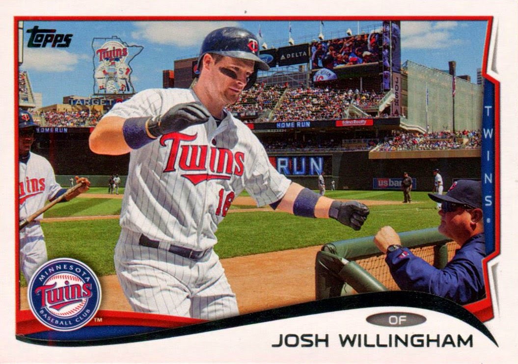
Home run celebration cards aren't that rare anymore but this is one of the better ones I've ever seen. Josh Willingham is coming back to the dugout and getting a fist bump from manager, Ron Gardenhire. I believe that's the bat boy trailing behind him. You also get a great shot of Target Field. And if you click on the photo to see a full screen version, you'll notice a reverse view of Willingham on the jumbotron in the background (to the right of his face). Plus, look at all the player and umpire cameos in the background! So much to take in. Great shot!
Wrapping up today's post are two "Cubs" cards. One shows Rizzo as the lead out on a potential double play. The other is the only actual Cubs card from either pack, pitcher Edwin Jackson. That is one salty cap.
Kind of anticlimactic, I know. But go vote for horizontal cards!


I agree that the horizontal cards usually look better photo-wise, but they look worse design-wise almost every time. I would never complain about a horizontal card if they would make the entire set horizontal like 1955 or 1960. Modern sets just look horrible in binders though with the criss-cross action.
ReplyDeleteI get the binder thing but I tend to keep my complete sets in boxes so I don't run into that myself personally. My horizontal collection is in a binder together so it ends up being more like a flip book than how you normally hold a binder.
DeleteI know you said almost every time, but I think this set is a good example of horizontals that look better design-wise than the verticals. That could be blamed on poor cropping or photo selection on the verticals but the pinch caused by the "tab" hurts the design more so than on the horizontals.
Personally, on just the sample size of the cards above, I would change something on all but one of the vertical cards (the Solano is sharp despite the Cubs double play). Conversely, I would probably only change one of the horizontal cards (Conger's head is cut off, tsk tsk).
But, like, that's just my opinion man.