
I have nine variations of Campana's 2011 Topps Update card. Yes, 9. All except the 1/1 Canary Yellow and 3 printing plates. To see them individually (and the rest of my TC PC), click the tab up at the top or here.
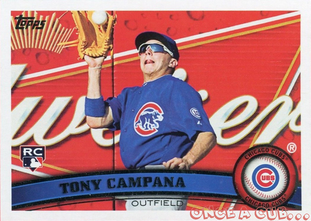
They look nice in a binder page since there are 9 but I'm looking to do a little bit more. For a refresher, here's the base card:
I also have a copy of the original photo Topps used to make the photo:
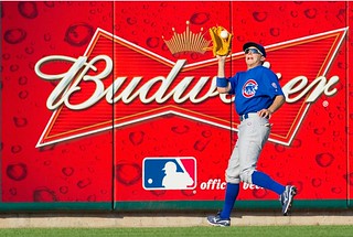
I would like to get a 8x10 copy of the photo autographed, and then have it matted and framed with the nine variations. But I am having a hard time deciding how to crop the photo. I've done two quick photoshop mockups of what I'm talking about and would be interested in hearing everyone's opinions about which way to go.
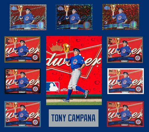
The background matting is Cubs blue but I will probably go with a double or triple mat with the other Cubs colors. The spacing isn't perfect and obviously the "name plate" will be a lot nicer. Like I said, this is just a quick mockup.
Option 1:
Cropped so that the photo is vertical rather than horizontal and you can see all of Tony Campana. Would probably get it signed in the upper right hand corner of the photo.
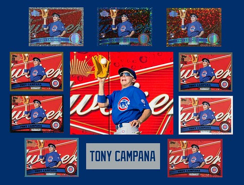
Option 2:
Photo loses quality with this tight of a cropping but it is cropped more like the card. Autograph still probably in upper right hand corner.
Definitely interested in hearing opinions and/or other ideas! Thanks!
Of those two, I like option 1 best, because it shows more of the photo. It's also cropped just enough to not make it look like just a beer ad, which is what the full 8x10 might feel like.
ReplyDeleteBoth photos would be 8x10 regardless as I have a high res scan of the photo. But the one for option 2 is closer cropped and loses some of the clarity.
DeleteOption 1 surely.
ReplyDeleteI would go with Option 1 as well.
ReplyDeleteBut, let me give you another idea for cropping. Crop it a little more horizontally so that it looks like the card from left to right, but vertically so that you have a full image of Campana from head to toe. This wouldn't be very much different than Option, but I think it's neat the way Option 2 crops left to right just as Topps did, and think Option 1 would look even better this way.
Just my 2 cents. Either way, that collection of Campana cards is really sweet!
So crop it closer on the sides (essentially cutting off the D and R in Budweiser) so that the photo is more like a 6x10? I guess I could still print it as an 8x10 but have the mat cut tighter?
DeleteMy opinions are, I like option 1 better. I like that version of the 8x10, although I would personally have him sign it in the middle just below center (across his thighs in blue sharpie). I would also line up the top row outer cards with the rest in their respective columns.
ReplyDeleteAre you sure you want to do this now though and risk the canary yellow or printing plates showing up for sale just after you get it done?
My solution to the canary yellow would be to have the nameplate be the size of the card and switch it out if I ever do come across it. I only have one of the four printing plates so I'm not particularly worried about them showing up.
DeleteIf they do, I can always do something separate for them. Nicely framed in a column or square.
Hmmm, makes me wonder if anybody has ever completed a set of all 4 printing plates of any card.