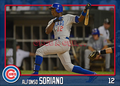
I mentioned in yesterday's post that I feel like I've neglected my ATCRCS cards lately and I have. But rather than spend some time on them, I decided to break out a new design. Nothing too fancy with some good action shots. Once I was satisfied with the template, the cards only take about 10 minutes each.
Have I mentioned I like a nice horizontal card???
 |
| Darwin Barney |
 |
| Starlin Castro |
 |
| Ryan Dempster |
 |
| Rafael Dolis |
 |
| Bryan LaHair |
 |
| Carlos Marmol |
 |
| Jeff Samardzija |
 |
| Alfonso Soriano |
 |
| Luis Valbuena |
 |
| Travis Wood |
Let me know what you think!

They look very nice. I especially like how you used the font the Cubs use for the numbers on the card. Gotta make a Rizzo card, though.
ReplyDeleteThanks! A while ago I found a place to get fonts used by all the different teams. It's supposed to be the one used for the names on the back of the and I'm guessing it's the same for the numbers. I use that font quite a bit in my customs. On my ATCRCS cards, it is on the back and used for the names.
DeleteRizzo and the rest of the team are coming but I set some criteria for the photos which makes them harder to find. Obviously, they had to be horizontal. And I wanted the crop to be tight enough (while maintaining a high pixel count) that some part of the player stuck out of the border to give it the 3D-ish effect.
I think you're on to something here with the horizontal cards. Granted, not every shot will work well with a landscape format, but you've done a nice job with your photo selections.
ReplyDeleteI think Topps should produce an entire set with horizontal formatting. They were strictly vertical for years!
That LaHair card turned out awesome! Can't decide if I like the new or the old ATCRCS better, they're both really good.
ReplyDeleteI agree with Wrigley Wax, I kept waiting to see Rizzo. Can't believe the roll he's on since being called up. I looked up and compared his Pads/Cubs stats, but it's too depressing to post.
Anyways, great cards, keep it up!
LOVE horizontal cards! I collect autographs and they make for the nicest signature opportunities-not all cramped and/or slanted on a vertical card.
ReplyDeleteAdded points for having the image pop out of the frame.
Nice batch!